

Cards layout
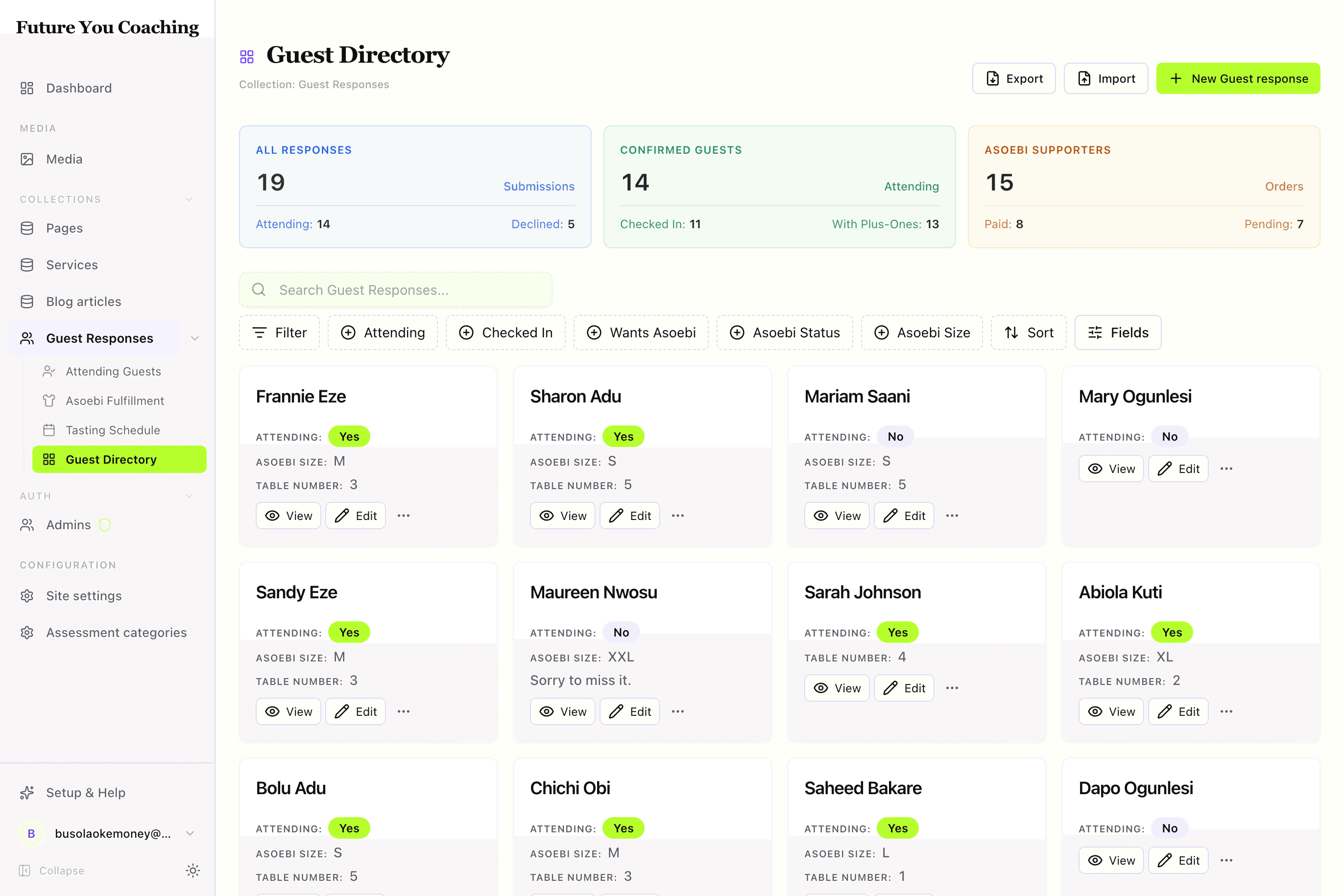
A visual gallery — cover image, compact rows, search and faceted filters, per-view column controls.
A gallery is a table with faces. When the record is understood faster from a cover, avatar, or thumbnail than from a row of text — profiles, listings, portfolios — a grid reads where a table scans.
By the end you should know when a gallery wins over a table, which fields become the cover and the rows, and how search and facets persist.
Visual outcome
When to use
- Use when: Records have visual assets (
image,avatar, or media thumbnails) where visual scanning is faster than reading text rows (e.g. member directories, real estate listings, catalog portfolios). - Don't use when: The task requires dense numeric editing (use
spreadsheet), status pipelines (usekanban), or detailed audits/exports (usetable).
Complete example
Configure a visual card gallery with cover images, quick row actions, and summary metrics:
import { defineView, defineAction } from "@dyrected/core";

const checkInAction = defineAction({
  name: "checkIn",
  label: "Check In",
  icon: "UserCheck",
  type: "row",
  mutation: { checkedIn: true, checkedInAt: "now()" },
});

export const guestDirectory = defineView({
  slug: "guest-directory",
  label: "Guest Directory",
  icon: "LayoutGrid",
  layout: "cards",
  columns: ["name", "email", "attending", "asoebiSize", "tableNumber"],
  actions: [checkInAction],
  metrics: [
    { label: "All Responses", color: "blue", aggregate: { count: "*" } },
  ],
});
columns controls the card fields. If the collection includes an image, avatar, or media field, Dyrected displays it as the card's visual cover. actions places quick one-click buttons directly at the base of each card.
Grouped card galleries
Add groupBy to organize visual cards into categorized sections (e.g. by department, category, or status):
import { defineView } from "@dyrected/core";

export const staffByDepartment = defineView({
  slug: "staff-by-department",
  label: "Staff by Department",
  icon: "LayoutGrid",
  layout: "cards",
  groupBy: "department",
  columns: ["name", "role", "email", "avatar"],
});
Chrome features
- Live Backend Search: Search queries text and email fields across large datasets instantaneously.
- Unified Filter Menu: Filter by badges, select fields, numbers, or dates with active filter count badges.
- Field & Label Toggles: Editors can toggle column visibility and label density via the Fields menu.
UX guardrails
- Best with images: Cards shine when records have visual media. If your collection contains only plain text, a
tablelayout provides higher information density. - 2–3 rows per card: Keep card content brief (e.g. name, role, tag). Deep multi-line text belongs on the record's detail page.
- Quick row actions: Limit card buttons to 1–2 high-frequency actions (
VieworCheck In).