

Table layout
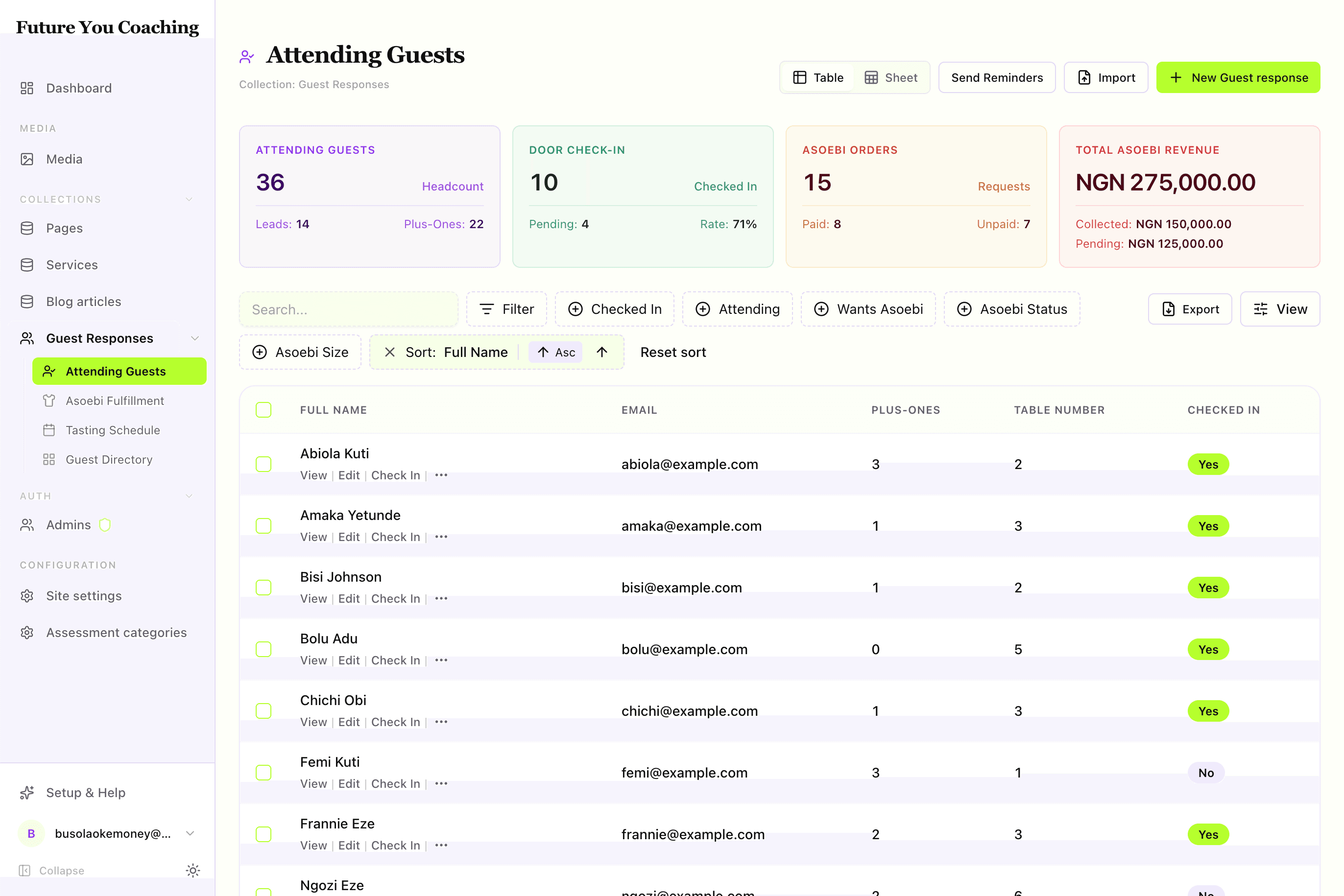
The default workspace for finding, filtering, and acting on records — faceted pills, column controls, and a floating bulk bar.
The table is the workhorse. When editors need to search, narrow by facets, scan columns, and act on one or many rows, start here. Every other layout optimizes for a narrower job — the table optimizes for completeness.
By the end you should know how the table chrome works, which defineView keys drive it, and what a shipping-ready table view looks like.
Visual outcome
When to use
- Use when: The primary job is searching, filtering, auditing, and executing row or bulk actions (e.g. guest list check-in, order fulfillment, data exports).
- Don't use when: The workflow is inherently a multi-step pipeline (use
kanban), calendar-based (usecalendar), or image-heavy (usecards).
Complete example
Configure a table view with custom row actions, initial sorting, and summary metrics:
import { defineView, defineAction } from "@dyrected/core";

const checkInAction = defineAction({
  name: "checkIn",
  label: "Check In",
  icon: "UserCheck",
  type: "row",
  confirm: "Confirm guest check-in at the door?",
  mutation: { checkedIn: true, checkedInAt: "now()" },
});

export const attendingGuests = defineView({
  slug: "attending-guests",
  label: "Attending Guests",
  icon: "UserCheck",
  layout: "table",
  filter: { attending: { equals: true } },
  columns: ["name", "email", "guestCount", "tableNumber", "checkedIn"],
  sort: { field: "name", direction: "asc" },
  actions: [checkInAction],
  features: { exportSelected: true },
  actionOrder: ["checkIn", "view", "edit", "delete"],
  metrics: [
    { label: "Total Attending", aggregate: { count: "*", where: { attending: { equals: true } } } },
  ],
});
The base filter restricts data to confirmed attendees, columns sets the initial visible fields, features enables CSV export for selected rows, and actionOrder places the Check In button right at the start of each row.
Grouped tables
Add groupBy to organize table rows into collapsible sections with item count badges:
import { defineView } from "@dyrected/core";

export const groupedGuests = defineView({
  slug: "table-groups",
  label: "Seating Tables",
  layout: "table",
  groupBy: "tableNumber",
  filter: { attending: { equals: true } },
  columns: ["name", "email", "guestCount", "checkedIn"],
});
Editors can expand and collapse groups individually. Bulk actions apply to selected rows across groups.
Chrome and configuration mapping
| Table Feature | Configuration Key | Description |
|---|---|---|
| Search Bar | admin.searchableFields | Live debounced, case-insensitive search across the collection's text-like fields (text, textarea, richText, email, url) on the backend. |
| Filter Menu & Pills | Interactive toolbar | Searchable command menu supporting text, number, date, select, and boolean filters. Active filters display as removable pills with total count. |
| Filter Match Logic | Toolbar toggle | When 2+ filters are active, switch between Match: All (AND logic) and Match: Any (OR logic). |
| Column Visibility & Order | columns & Fields toolbar button | Sets initial visible fields; editors can show/hide and reorder columns per user. |
| Floating Bulk Bar | type: "bulk" actions | Appears automatically when one or more rows are selected via checkbox. |
| Sorting | sort | Initial sort field and direction; can be toggled by clicking column headers. |
UX guardrails
- Columns 3–5: Start with the title field plus 2–3 key status or operational fields. Editors can toggle additional fields using the View menu.
- Row actions 1–2: Put the primary workflow verb first with
actionOrder, keepingview/editsecondary. - Metrics 2–3 above the fold: Display summary KPIs at the top to provide quick context at a glance.
Next steps
- Add workflow buttons — Actions
- Add KPI summary cards — Metrics
- Best practices & layout comparison — UX guidelines
- Explore other layouts — Kanban, Calendar, Cards, Spreadsheet